Objective
To develop a machine learning algorithm that uses distances to landmarks to improve property value predictions in Fulton County, GA, and to present the results in an interactive visualization.
Visualization
The map on the left is color-coded by the field selected in 'Variable 1'. The graph on the right displays a scatterplot of Variable 1 and 2. The histogram beneath the scatterplot shows the distrubution of Variable 2.
Hover over a datapoint on either scatterplot to display specific data about that property.
Select variables from the two dropdown menus to change the axes in the graph on the right.
Prices are displayed as number of 100,000s of dollars (ex. 420,000 --> 4.2)
Square footage is displayed as number of 1000s of sq. ft. (ex. 1,500 --> 1.5)
CSE6242 Team Project Sara C., Nicholas K., Cameron C., Nate K.
Apologies for the visualization being slow to load. The visualization is handled entirely in-browser including the parsing of data from CSV files. Ideally I would just query a database or something else, but for a school project, this was sufficient.
Machine Learning Models
Although many different regression models were trained for this project, the visualization includes only the results of a linear regressor and a neural network. Each were trained both with and without data representing the distances to nearby key landmarks like schools and parks.
Results
Model Performance
First, choose "Prediction, NN w/o Landmarks" as Variable 1 and "Truth, Appraised Total" as Variable 2.
If the model were perfect, the graph on the right would display a straight line because the prediction would always equal the true appraised total (y=x). However, you can see quite a lot of spread from a straight line.
Now choose "Prediction, NN w/ Landmarks" as Variable 1. Notice how much less deviation there is from a straight line behavior. The neural network model using landmarks is able to predict value much more accurately than without landmarks.
Weird square footage groupings
First, choose "Prediction, NN w/ Landmarks" as Variable 1 and "Square footage" as Variable 2. You should see something like the graph below.
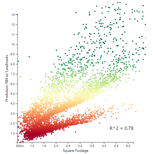
Prediction, NN w/ Landmarks as a function of Square Footage
Notice how there appears to be three separate clusters or lines formed on the right graph? Now drag your mouse over these clusters (so the large blue point moves around) and observe where those points are located in the map to the left. The lowest cluster corresponds to points geographically southwest, the middle cluster to the geographic north, and the top cluster to the geographic center.
Now switch Variable 1 to "Truth, Appraised Total". Although the clusters are not as defined, when you drag your mouse over the datapoints on the right graph, you see a similar behavior on the map to the left.
What does this mean? It shows us that our neural network model is changing the predictive weight of square footage based on the distance to landmarks. This same behavior is not observed when plotting "Prediction, Linear w/ Landmarks" against "Square Footage", because the parameter weights cannot change dynamically like that in a linear model. It follows that the neural network model performs better than the linear model, but still does not account for enough of the variance in the true values.
Takeaways
Much like with Anscombe's quartet, visualization is absolutely vital. Machine learning and data analysis are both great ways of modeling data and taking advantage of trends and correlations, but you MUST always visualize the results and see what they are telling you. Why does one model perform better than the other? Why does this model seem to overestimate a certain domain? Visualization can help determine those answers with more certainty than simple metrics like correlation, R^2, standard deviation, etc.
Data Scraping
All the data used in this project is publicly available by law through tax records. However, the Fulton County websites (B.O.A. and B.O.C.) which hold and distribute this information are only GUI based and have no publicly available API. Additionally, any data export from the GUI is limited to only about a hundred properties out of the 360,000 total, and all inqueries with the boards' employees were unsuccessful in retrieving the data.
Thus, to gather the data for this project, I wrote a web scraper taking advantage of the patterns I found in their website urls to bombard the Fulton County Board of Assessors ASP.NET web app with queries for all the tax parcels. The end result was a complete dataset of all 360,000 registered property tax parcels in fulton county